Where to Start With Sonder Designs: Wordmarks, Silhouettes, Cherubs and More

Three figures standing side by side in warm amber, the one on the left in a flash of vermilion. That single image says a lot about Sonder's look: quiet, a little hazy, made for late nights. It is also just one of twelve designs in the range, and when you are looking at all of them at once it can be hard to know which one is yours. This guide sorts them into a few easy families, says what each design actually shows, and points out who each one suits.
Who is Sonder, in one paragraph?
Sonder is an R&B trio: producers Atu and Dpat, with Brent Faiyaz on lead vocals. The group formed in October 2016 and put out its debut single, "Too Fast", that same month. The seven-track EP Into followed in January 2017, and after singles like "What You Heard" and "Nobody But You" with Jorja Smith, the five-song Too Late to Die Young arrived in October 2022, the trio's first project together since 2017. Keep those two records in mind, because several designs lean on them.
Which design says "Sonder" most simply?
If you want the name and nothing else, start with the wordmarks. There are three, and each has a different mood.
- Periwinkle Wordmark (817): the name in tall, bold periwinkle-blue letters with a small star after the full stop. Bright, clean and easy to read from across a room. A good first piece.
- (n) Wordmark (3516): a heavy black sonder. with a small (n) above it, like a dictionary entry, and a line of four words beneath: Music. Community. Education. Advocacy. It is the most graphic of the three and works well on lighter colours.
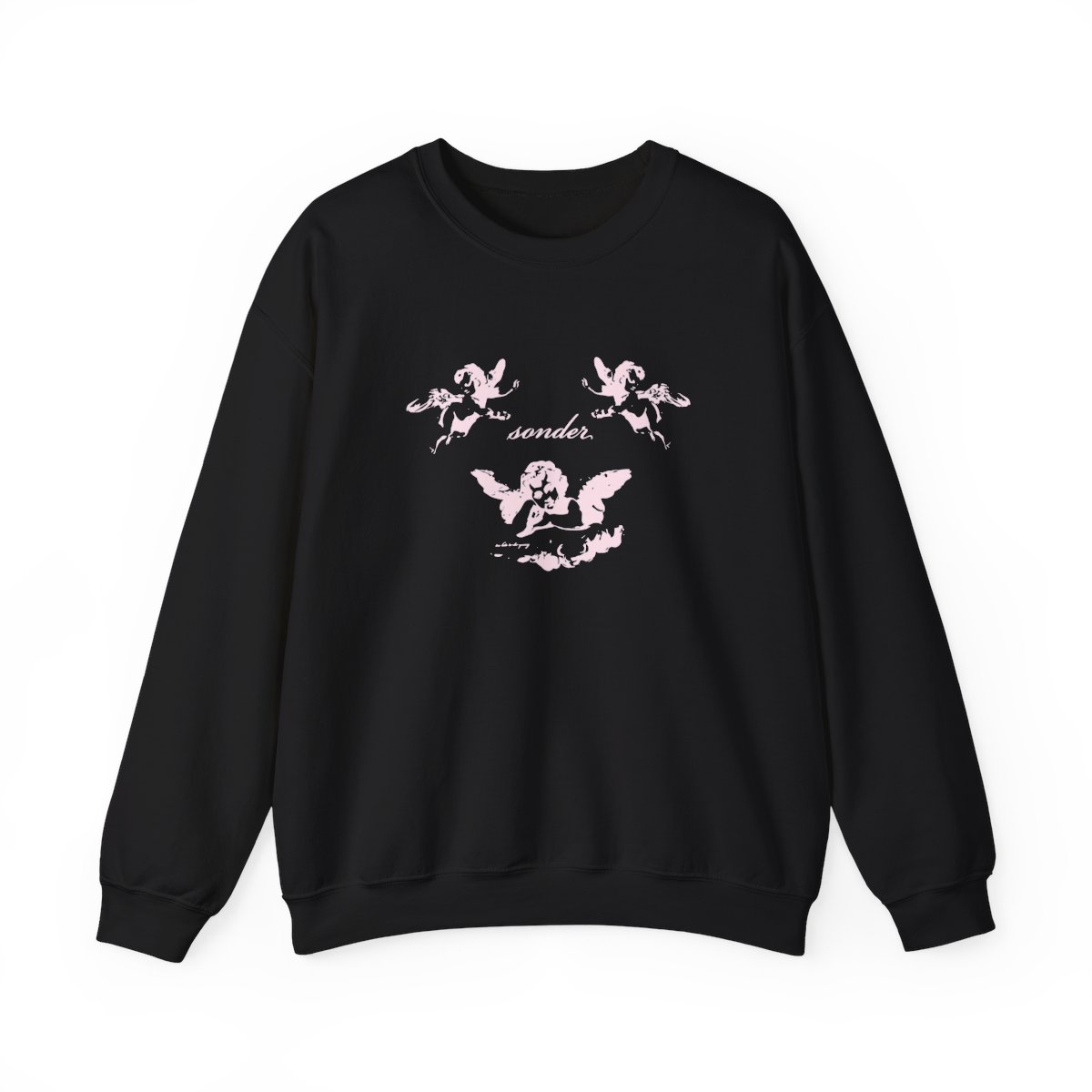
- Pink Cherubs (3520): a looping script sonder. surrounded by three blush-pink winged cherubs, two in the top corners and one sitting on a cloud below. Soft, romantic, a little playful.
The cherubs are the one people tend to stop on. They suit anyone who likes their merch with a bit of tenderness rather than attitude, and they look especially good on the Pink Cherubs crewneck sweatshirt, where the design has room to breathe across the chest.
Which designs feel most like the music?
For the late-night, hazy side of Sonder, look at the image-led designs.
Amber Silhouettes (3511) is the one from the opening: three standing figures in amber, the left one in a vermilion top. It is warm and understated, the kind of design that reads as a mood more than a logo. Earthy colours sit nicely beside it.
Liquid Oval (3512) is the most abstract piece in the range: a wavy black oval outline with a pale, swirling shape inside, all in black and white. No name, no title. It suits someone who likes a design that starts a conversation instead of ending one.
Too Late to Die Young Strip (3518) is the one for the record. It puts the sonder. wordmark and the too late to die young. title above a strip of three colour film stills: a yellow silhouette, a red figure and blue tree shapes. If the 2022 EP is the one you keep coming back to, this is your design, and you can read the full story of Too Late to Die Young, from the April 2021 teaser to the five songs that arrived in October 2022.
What about the light designs?
Five designs are light-coloured art meant for darker garments, and they are mostly about placement: where the Sonder design sits on you.
- Wide Light Front (3521): spreads across the chest. The most visible of the set.
- Back Mark (1055): a wide design across the shoulders, so the front stays plain.
- Tall Light Back (3522): runs down the length of the back.
- Narrow Light Back (3523): a slimmer design down the middle of the back.
- Light Front and Back (3514): both at once, a slim mark on the front and a tall design on the back.
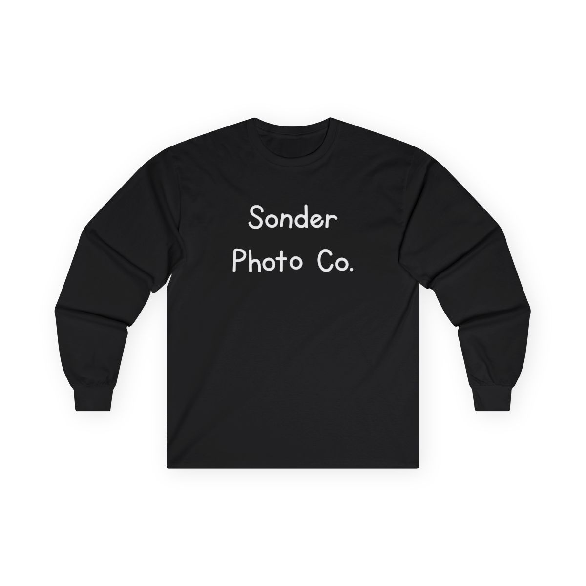
A quick way to choose: if you want people to see it face to face, go for a front design; if you live in jackets and only take them off at the show, a back design is the one that gets noticed. The Wide Light Front long sleeve tee is a good in-between-season pick, light art on a dark long sleeve that layers easily under an open jacket.
Is there something for the holidays?
Yes: the Christmas Sweater (3519) design. The front has a big red SONDER framed by borders of green pixel trees, red diamonds and zigzags, just like a knitted holiday jumper. The back carries a row of red gift boxes, a green zigzag and small red hearts. It is the most cheerful thing in the range, and an easy gift for someone who already plays Into on repeat.
Which one should you pick?
If you are still deciding, here is a short version:
- Just the name, bright and simple: Periwinkle Wordmark.
- Something soft and sweet: Pink Cherubs.
- The mood of the music: Amber Silhouettes or Liquid Oval.
- For the 2022 EP: Too Late to Die Young Strip.
- For a dark garment, placed your way: one of the light front or back designs.
- For December: Christmas Sweater.
The designs come on tees, long sleeves, crewnecks and hoodies, with kids' and youth sizes too, and every product page has its own size chart to check against a piece you already like the fit of. Whichever family you land in, there is a Sonder design that fits the way you wear things, and the whole range is waiting in the shop.